The most important things at a glance:
- Colors influence our mental and physical well-being and we reveal how you can increase this
- With a balanced color scheme you can create peace and relaxation
Red, blue, green or purple?
Whether consciously or not, colors say a lot about us. From our choice of clothing to our own four walls The colors we use to show ourselves are an expression of our deepest feelings and unconscious sensations. There is even a whole science about our relationship to the colors that surround us: the so-called Color psychology .
What is color psychology?
As the name suggests, color psychology deals with the psychological effects and effects of individual colors on our mental well-being , our emotions and our way of seeing the world. Simply put: the perception of certain colors creates certain mental patterns or even chemical reactions like that Release of dopamine and thus influences our well-being or even our actions. This idea has far-reaching implications for psychology, but also for advertising, entertainment and very private decisions like our interior design.
And often these decisions and reactions are completely unconscious. For example, if we look at a yellow-black striped insect fly past us, we avoid instinctively It could be a bee, wasp or hornet, whose stings (although usually not life-threatening) painful Such warning signals are subconscious and instinctive and are triggered even if the insect is not a bee or wasp. We humans have had this instinct for thousands of years. integrated into our thinking and in many cases even across countries and cultures. To take the color of bees as an example, Danger signs and barriers often designed with a mix of yellow and black to attract our attention and alert our senses to potential danger.
But colors also have more subtle and very complex effects on our psyche that go beyond the mere recognition of danger. Some colors make us happy, sad, or relax. since Goethe's theory of colors People are actively studying the effects of different colors on our mood. The color red is still present in our minds from the days of hunting and gathering. Red berries and fruits were necessary for survival and gave us a stimulus for delicious, sugary foods. Today, restaurants and food brands use the color red to grab our attention and stimulate our appetite. Examples from America include Five Guys, Campbell's, Trader Joe's, and Chick-fil-A.
Other colors can even influence our quality of life. Green represents renewal and growth. There are more than 100 shades of green, and artists use it to depict nature, especially spring. Green is considered environmentally friendly, fresh, and healthy. The greener lettuce and peas are, the healthier we perceive them to be. And it also makes us feel relaxed. This is also how we explain the saying "everything is in the green zone." Interestingly, shades of green are associated with wealth in America. Understandable, because we American fans know that US dollar bills are green (greenbacks).
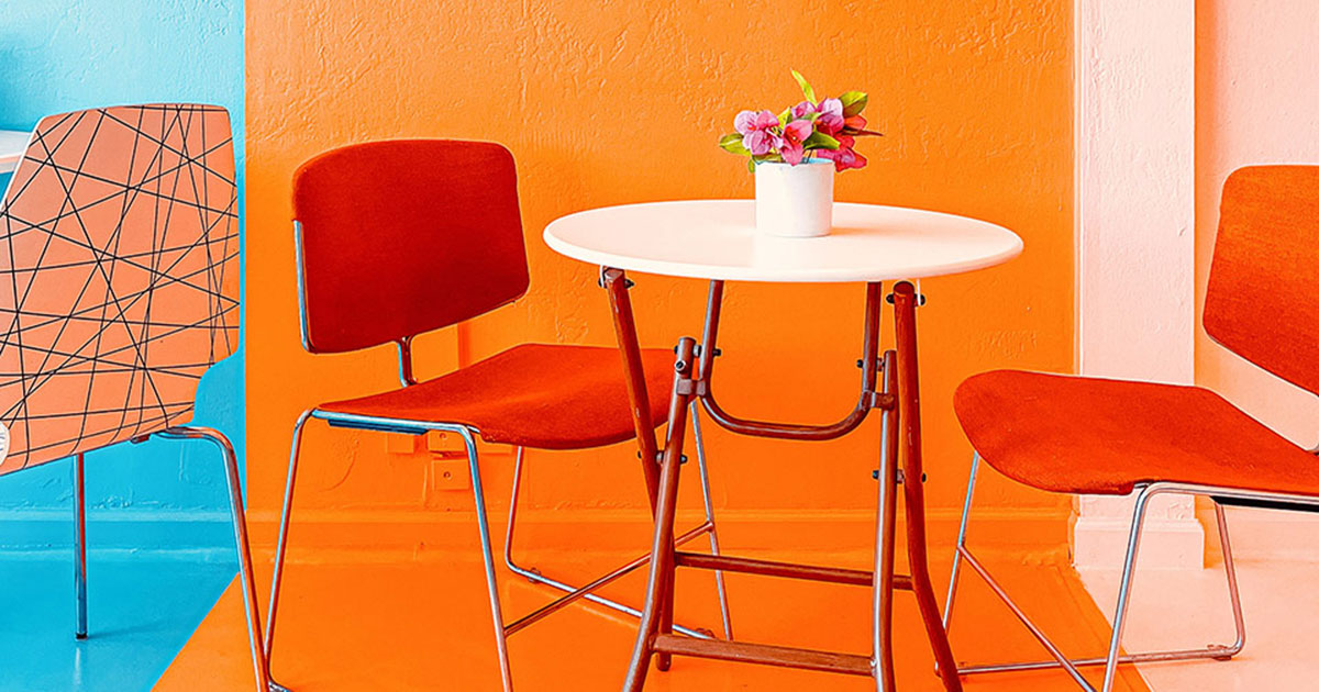
Colors can also Temperature perception We even differentiate between so-called “warm” colors (like red and orange) and "cold" colors , such as blue. Here, too, the reason probably lies in evolution. The attention-enhancing effect of signal colors such as red etc. also stimulates our body, as we are in the so-called Fight-or-Flight mode The body prepares itself for the need to act quickly in an emergency, for example, by increasing the heart rate and tensing the muscles. This literally creates heat in our system, similar to shivering in cold weather.
Peace & relaxation – The color psychology of your own four walls
Of course, we want to feel at home calm and relax and not be constantly agitated or on alert. Color psychology provides us with a whole palette of wonderful colors with which we can transform our home into an oasis of calm and peace:
Pink
Pink is a pleasant color for most people and gives a feeling of Security and compassion . For this reason, pink is also a popular color choice for children's clothing. When mixed with white, pink The aggressive qualities of red are toned down . Pink retains the warm qualities of red, but still creates a calm and relaxed atmosphere.
Pink that deviates too strongly into red could put us back into danger mode. So if you want to relax, you should hold back on red accents or alternatively rather on reddish-brown colors Also Pink is problematic. It has even more erotic and stimulating undertones than red. For highlights, it's better to use lighter complementary colors, e.g. White or light gray tones . However, it is important a balance and not to integrate too many “cold” colors into the already light pink.
What may surprise many: Pink and rose used to be primarily colors for boys and men , instead of being associated with femininity as they are today. Before they were even defined as pink and rose relatively recently, these colors were actually just forms of red, the as a signal color rather masculine qualities Blue, on the other hand, was considered a calming, subtle color reserved for women and girls. This actually changed only in the 1940s .
Blue
Blue is a very attractive and calming color . In contrast to red, it relaxes us and allows us to breathe. Blue gives us a feeling of Security, trust and stability , which is why banks and many institutions, such as the police, use this colour. Mixtures with grey and green also have a very calming effect and are, for example, Perfect for the bedroom . Some studies in countries like Scotland and Japan even suggest that blue light in street lighting reduces crime and suicide rates, probably because, unlike the warm orange/yellow light of most street lamps, it doesn't activate our fight-or-flight reflex, which makes us irritable or even aggressive.
So let’s make the right choices: a light blue or cyan as the base color and set a warmer blue with some red warm highlights. These colors can be due to the red Generate attention They are therefore used in web design, for example, for buttons and links to encourage users to click. So, if you want to put a piece of furniture or something similar in the spotlight, this is a good option.
If you use a warm blue as the base color, lighter blue and cyan are also suitable. light gray tones, cream colors and white as accents. Also a Contrast with orange can make a big visual impression, but here we take into account that orange is again a warning and signal color.
Did you know: Many ancient cultures probably didn't have our current concept of the color blue. While many ancient civilizations have words specifically for the color cyan, the color blue is actually very rarely mentioned in ancient texts and writings. Of course, people back then were already familiar with the color, but they had no idea what it was. usually does not have its own name . Descriptions of sea and rain, for example, often refer to the colour as a Form of black or even copper-colored , because copper tarnishes green/turquoise and even blue under certain influences.
Brown
Brown can also can have a very calming effect if used discreetly and with not too many highlights. Brown is a relatively neutral color , because in nature, similar to green, it is very dominant and common and therefore already part of our natural environment . Brown has always been a guarantee for Security and tranquility , whether as the color of cave walls or the later stone and wooden buildings of civilized man. We are simply used to being surrounded by brown and so a brown environment calms us more than unnaturally bright colors.
For the main color, you should rather light and subtle brown tones Stone and rock are not deep brown or amber in color. These more intense tones with Shades of red and orange are more suitable for attractively placed accents.
Green
Strangely, green is a rare color in our living rooms and bedrooms. In other places, such as doctor's offices, green is often used in waiting rooms because, like blue and brown, it has a very calming effect Especially cooler green tones like mint or mixtures with blue and grey convey a feeling of calm .
Stronger tones, however, especially those with red and orange color accents, can quickly make us tense again, thanks to evolution. Although green is also present in nature, as universal as brown , but a thicket of plants (with the green of Chlorophyll and the light red of Carotenoids ) gave our ancestors, unlike the cozy cave, not necessarily a feeling of security, but also the potential danger For dark accents, such green tones should be used sparingly or even on Alternatives such as dark grey If you want to add highlights, white, cream, and light gray tones are a good choice.
Yellow
We associate yellow with the sun and it is therefore a positive and energetic color that animates and motivates us. Yellow also increases our Attention and concentration . Yellow is therefore particularly suitable for rooms such as Workrooms , where we are primarily concerned with productivity rather than relaxation. However, to avoid overstimulating our attention, we should subtle colors and pastel tones A bright yellow with its strong Signal effect rather for logos and many companies take advantage of this property by enhancing this effect with blue contrasts or red as an additional signal color.
If you use a subtle yellow as the base color, you can
Brown tones as contrast
If you like it particularly colorful, you can also play with orange, green, and blue-gray accents, but you should pay attention to balance so that the room doesn't suddenly appear too warm or too cold.
Purple
At the end, things get exotic again. Purple and violet are colors that are probably not found in most households. However, these colors also have a very calming effect, similar to blue. Culturally, we associate these colors with Luxury and nobility and thus also with an accompanying feeling of security .
For further calm notes, accents of Cream and light gray White should be excluded depending on the darkness of the base color, as it can create a very high contrast with pastel tones, which counteracts the calming effect.
If you want to be really daring, you can also combine purple and violet with their natural contrasting color, yellow. To avoid strong contrast, Yellow tones with a slight red component that are already turning orange. However, due to the signaling effect, one should proceed with extreme caution here.
The luxurious character of these colors is no coincidence. For a very long time, purple and violet were the most hardest color pigments to produce and therefore extremely expensive and reserved mainly for the nobility. They were mostly made from purple, which in turn was only Harvesting of certain sea snails and was therefore completely unsuitable for the mass market until the invention of synthetic pigments. This is also the reason why violet the rarest color on national flags worldwide. Today, only two countries have flags of this color: Dominica and Nicaragua, both countries that designed their flags in the early and mid-20th century.
Ready, set, go!
Anyone who has these new insights get involved yourself and wants to transform your own four walls into a cozy oasis of peace and relaxation for the winter and beyond, we have American Heritage something very special:
- Old-Fashioned Milk Paint in many great colors
The Milk Paint is considered powder delivered and is particularly suitable for great Textural effects . The advantages of milk paint over traditional chalk paints are numerous, and not just its greater environmental compatibility. With over 30 different great American colors, you're sure to find the perfect color. Alternatively, many beautiful colors can be mixed.
If you want to know more about the History and benefits of milk paints If you want to learn more about the colours and get some tips on how to use them, we recommend our Blog on the topic :
- MILK PAINT – ENVIRONMENTALLY FRIENDLY PAINT WITH A LONG TRADITION


